New Jersey provides a lesson for Kentucky
This from School Finance 101:
A while back, in a report from the NJDOE, we learned that outliers are all that matters. They are where life’s important lessons lie! Outliers can provide proof that poverty doesn’t matter. Proof that high poverty schools – with a little grit and determination – can kick the butts of low poverty schools. We were presented with what I, until just the other day might have considered the most disingenuous, dishonest, outright corrupt graphic representation I’ve seen… (with this possible exception)! Yes, this one:Comments on NJ’s Teacher Evaluation Report & Gross Statistical Malfeasance
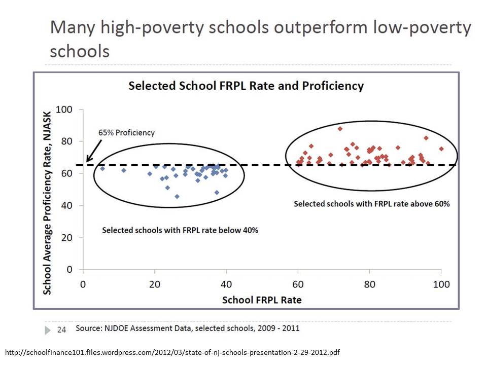
This graph was originally presented by NJ Commissioner Cerf in 2012 as part of his state of the schools address. I blogged about this graph and several other absurd misrepresentations of data in the same presentation here & here.
Specifically, I showed before that the absurd selective presentation of data in this graph completely misrepresents that actual underlying relationship, which looks like this:
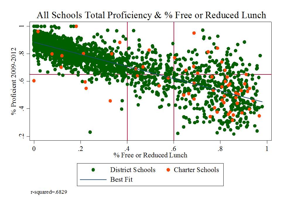
Yep, that’s right, % free or reduced priced lunch alone explains 68% of the variation in proficiency rates between 2009 and 2012 (okay, that’s one more year than in the misleading graph above, but the pattern is relatively consistent over time).
But hey, it’s those outliers that matter right? It’s those points that buck the trend that really define where we want to look…what we want to emulate? right?
Actually, the supposed outliers above are predictably different, as a function of various additional measures that aren’t included here. But that’s a post for another day. [and discussed previously here]
THEN came the recent report on progress being made on teacher evaluation pilot programs, and with it, this gem of a scatterplot:
This scatterplot is intended to represent a validation test of the teacher practice ratings generated by observations. As reformy logic tells us, an observed rating of a teacher’s actual classroom practice is only ever valid of those ratings are correlated with some measure of test score gains.
In this case, the scatterplot is pretty darn messy looking. Amazingly, the report doesn’t actually present either the correlation coefficient (r) or coefficient of determination (r-squared) for this graph, but I gotta figure in the best case it’s less than a .2 correlation.
Now, state officials could just use that weak correlation to argue that “observations BAD, SGP good!” which they do, to an extent. But before they even go there, they make one of the most ridiculous statistical arguments I’ve seen, well… since I last wrote about one of their statistical arguments.
They argue – in picture and in words above – that if we cut off points from opposite corners – lower right and upper left – of a nearly random distribution – there otherwise exists a pattern. They explain that “the bulk of the ratings show a positive correlation” but that some pesky outliers buck the trend.

Here’s a fun illustration. I generated 100 random numbers and another 100 random numbers, normally distributed and then graphed the relationship between the two:
And this is what I got! The overall correlation between the first set of random numbers and second set was .03.

Now, applying NJDOE Cerfian outlier exclusion, I excluded those points where X (first set of numbers) > .5 and Y (second set) < -.5 [lower right], and similarly for the upper left. Ya' know what happens when I cut off those pesky supposed outliers in the upper left and lower right? The remaining "random" numbers now have a positive correlation of .414! Yeah… when we chisel a pattern out of randomness, it creates… well… sort of… a pattern.
Mind you, if we cut off the upper right and lower left, the bulk of the remaining points show a negative correlation. [in my random graph, or in theirs!]
But alas, the absurdity really doesn’t even end there… because the report goes on to explain how school leaders should interpret this lack of a pattern that after reshaping is really kind of a pattern, that isn’t.
Based on these data, the district may want to look more closely at its evaluation findings in general. Administrators might examine who performed the observations and whether the observation scores were consistently high or low for a particular observer or teacher. They might look for patterns in particular schools, noting the ones where many points fell outside the general pattern of data. These data can be used for future professional development or extra training for certain administrators. (page 32)That is, it seems that state officials would really like local administrators to get those outliers in line – to create a pattern where there previously was none – to presume that the reason outliers exist is because the observers were wrong, or at least inconsistent in some way. Put simply, that the SGPs are necessarily right and the observations wrong, and that the way to fix the whole thing is to make sure that the observations in the future better correlate with the necessarily valid SGP measures.
Which would be all fine and dandy… perhaps… if those SGP measures weren’t so severely biased as to be meaningless junk.
Yep, that’s right – SGP’s at least at the school level, and thus by extension at the underlying teacher level are:
So then, what would it take to bring observation ratings in line with SGPs? It would take extra care to ensure that ratings based on observations of classroom practice, regardless of actual quality of classroom practice, were similarly lower in higher poverty, higher minority schools, and higher in higher performing schools. That is, let’s just make sure our observation ratings are similarly biased – similarly wrong – to make sure that they correlate. Then all of the wrong measures can be treated as if they are consistently right???????
- higher in schools with higher average performance to begin with in both reading and math
- lower in schools with higher concentrations of low income children
- lower in schools with higher concentrations of non-proficient special education children
- lower in schools with higher concentrations of black and Hispanic children
Actually, I take some comfort in the fact that the observation ratings weren’t correlated with the SGPs. The observation ratings may be meaningless and unreliable… but at least they’re not highly correlated with the SGPs which are otherwise correlated with a lot of things they shouldn’t be.
When will this madness end?

1 comment:
It is sad that our profession has moved so far toward homogenized quantitative data and unfortunately, its practitioners aren't skilled in this level of interpretation. As a result you have ripe conditions for misinterpretations and even misinformation to rule the day.
Teaching is a lot simpler and straight forward than this sort of evaluative process that leaders try to impose as their justification for oversight and "reform".
Post a Comment